ABCDou Insights
Exploring the world of news, trends, and information.
Typefaces that Capture Attention
Discover stunning typefaces that grab attention and elevate your design. Unlock the secrets to captivating typography today!
Top 10 Attention-Grabbing Typefaces You Need to Know
When it comes to design, the typeface you choose can make or break the effectiveness of your message. In the digital age, where a first impression counts, having attention-grabbing typefaces is crucial to capturing your audience's interest. From elegant serifs to bold sans-serifs, each typeface brings its own personality to your content. Here are the Top 10 Attention-Grabbing Typefaces You Need to Know:
- Montserrat: A modern, geometric sans-serif that is perfect for headlines.
- Playfair Display: A traditional serif with a contemporary twist, great for elegant blogs.
- Lobster: A lively script font that adds a playful touch to designs.
- Raleway: An elegant typeface ideal for professional websites.
- Bebas Neue: A clean, bold typeface that commands attention.
- Pacifico: A casual script that expresses a friendly vibe.
- Oswald: A reworking of the classic gothic typeface suitable for impactful messages.
- Roboto: A versatile sans-serif that maintains a friendly and approachable appearance.
- Amatic SC: A hand-drawn font that adds a unique character to any project.
- Cinzel: A font inspired by classical Roman inscriptions that adds an air of sophistication.

How Typography Influences Reader Engagement: The Science Behind Typeface Selection
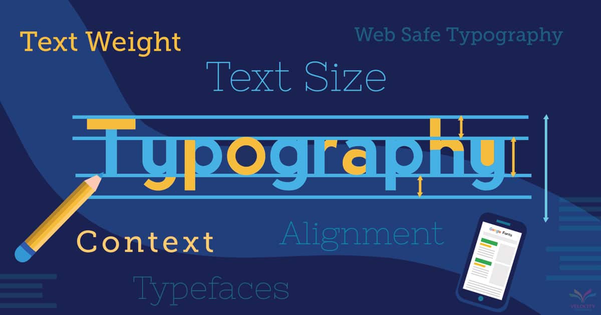
Typography plays a crucial role in engaging readers, influencing not just how content is perceived but also how easily it is consumed. The choice of typeface can affect readability, making it essential for content creators to understand the implications of various styles. For instance, serif fonts are often viewed as traditional and trustworthy, while sans-serif fonts typically present a more modern and clean aesthetic. Research shows that viewers are likely to spend more time on pages with well-chosen typography, as it creates a more inviting atmosphere for reading.
Moreover, the scientific principles of typeface selection indicate that the right typography can significantly impact emotions and attention spans. Fonts that are too elaborate might distract or confuse readers, while clear, straightforward fonts can promote better information retention. To enhance reader engagement, designers and content creators should consider factors such as line height, font size, and spacing. In doing so, they can create a balanced layout that guides readers effortlessly through the text, fostering a deeper connection with the content.
What Makes a Typeface Captivating? Key Features to Consider
When selecting a typeface, several key features contribute to its overall captivation. The first is legibility, which determines how easily your audience can read the text. A typeface that is too ornate or overly stylized can detract from the message you intend to convey. Additionally, the personality of the typeface plays a crucial role. Different typefaces evoke different emotions; for instance, serif fonts often project tradition and reliability, while sans-serif fonts tend to feel more modern and approachable.
Another important aspect to consider is the versatility of the typeface. A captivating typeface should work well across various mediums, whether print or digital, and should maintain its integrity in different sizes and weights. Finally, the contrast within the typeface, such as the thickness of the strokes and the spacing between letters, can significantly impact its appeal. A well-designed typeface balances all these features, creating a visually stunning and effective tool for communication.