How to Choose the Perfect Color Scheme for Your Website
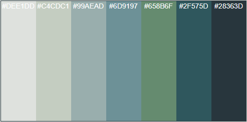
Choosing the perfect color scheme for your website is crucial, as it influences user experience and brand perception. Start by considering your target audience and the emotions you want to evoke. For instance, if you aim to convey trust and professionalism, colors like blue and gray can be effective. Utilize a color wheel to explore complementary colors, ensuring a harmonious balance. Additionally, implementing accessibility guidelines, such as sufficient contrast between text and background, will enhance readability and user engagement.
Once you have a foundational palette, test your colors in various contexts, such as digital devices and print. Don't shy away from seeking feedback – it can provide valuable insights into how your chosen color scheme resonates with users. Remember to keep a consistent theme across all pages of your website to establish a cohesive brand identity. Lastly, consider creating a style guide to document your color choices, ensuring that any future design efforts align with your website's overall aesthetic.
The Psychology of Color: What Hues Work Best for Your Brand?
The psychology of color plays a crucial role in branding, influencing consumer perceptions and emotions. Different hues elicit varying responses, making it essential for brands to choose their color schemes wisely. For instance, blue often conveys trust and reliability, making it a popular choice for financial institutions and tech companies. In contrast, warm colors like red and orange can create feelings of excitement and urgency, suitable for brands looking to encourage impulsive purchases. Understanding these associations can help businesses align their visual identity with their core values and target audience.
When selecting colors for your brand, consider employing the 60-30-10 rule for a balanced color palette: allocate 60% of your primary color, 30% for secondary hues, and 10% for accent colors. This method ensures that your brand's message is communicated effectively while maintaining visual appeal. Additionally, it's essential to test your color choices across different platforms and mediums, as colors can appear differently in digital contexts versus print. By effectively leveraging the psychology of color, brands can create a memorable identity that resonates with their audience and drives engagement.
Color Wheel Basics: Mixing Hues for Optimal Web Design
The color wheel is an essential tool for web designers, providing a visual representation of the relationships between different hues. Understanding how to mix and match these colors effectively can result in aesthetically pleasing and engaging websites. At its core, the color wheel is divided into primary, secondary, and tertiary colors. Primary colors (red, blue, yellow) can be combined to create secondary colors (green, orange, purple), while tertiary colors result from mixing primary and secondary hues. By grasping these basics, designers can create harmonious color schemes that resonate with their target audience.
When it comes to applying the principles of the color wheel in web design, consider using complementary, analogous, or triadic color schemes. Complementary colors are opposite each other on the wheel and create a vibrant contrast when used together. Analogous colors, which are next to each other, offer a more serene and cohesive look. Lastly, triadic schemes involve three evenly spaced colors on the wheel, providing a balanced yet visually stimulating palette. By leveraging these mixing strategies, designers can optimize their web designs to enhance user experience and drive conversions.